Thursday, August 29, 2013

Spines II - Things just got spiney-er

 
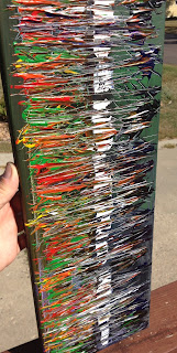
The second in the "Spines" series has arrived! "Spines II" is the sequel to the original spines painting which I unveiled three or four posts ago.  To be completely honest I didn't really care for the Spines painting...however, out of all the paintings I have done, that's that one that has received the most praise.  So, I'll give the people what they want....more spines!
 
 
I chose to not limit my color pallet and instead worked with the idea of color vs. lack of color. Or light vs. dark I guess.  There is so much going on in this painting that my feeble Iphone camera really has had a tough time picking up the subtleties.  The first and last pictures are probably the best visual representations.

 
This painting like the other was a practice in using the paint knife.  I started with blues and greens in the background and then really went a bit crazy with the rainbow of color.  After the rainbow was laid down I started to play with the dark idea.  I incorporated the black and purple bottom portion, but still wasn't satisfied.

 
After staring at the painting for an hour or so I decided to add the bold white streak through the middle.  At that point I went back to the paint knife to bring things together.  Spines II is much like the original in the fact that I don't really like it all that much.  This might be the last spine theme painting I do for a while.  Or will it?
 
"Spines II"
 
Acrylic on Canvas
 
8in x 24in x 3/4in
 
$75.00


Monday, August 26, 2013

"Trees III" Return of the Sapling

 
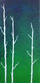
Here is the third installment of the Trees series...I know we're all getting a little tired of trees...I promise a change in thought starting tomorrow!  However, it's eleventy five degrees in Minnesota and my yard is somehow full of leaves....which makes me think of trees and global climate change...but I don't have any paintings of Al Gore...so you get more trees!


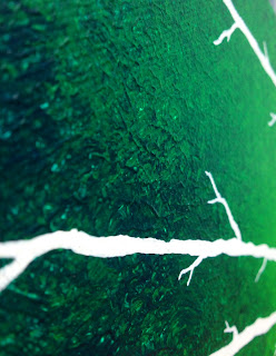
This is a rather small painting...quaint if you will, fit for a breakfast nook or study, or above a toilet for that matter.  The concept, as usual, started with the background.  I used five different shades ranging from straight green to straight blue. 


First, I blended the colors with a wide brush.  Once the blending was complete I went with a thick brush and produced a stippling effect to give it a bit more depth.  I added some green that creeps up the middle of the painting and fades into the blue.
 
 
Once the background was finished I just couldn't resist the allure of those snow white trees.
 
"Trees III"
 
12in x 6in x 3/4in
 
Acrylic on Canvas
 
$45.00


Friday, August 23, 2013

Sunset City

Today we go way back to somewhere around 2006 or 2007.  This painting was really early on in my experimenting with acrylics on canvas.  I really had no idea what I was doing or how I was going to do it.  None the less I think this one did well in pushing me to travel further down the abstract path.
 
 
The imagery here started with the background as my paintings often do.  Once I had the sunset background finished I used my paint knife for the very first time.  Let it be known that the power of the paint knife should not be under estimated. 


My lack of ability at the time gave me these very crude and dirty looking buildings which I ended up liking quite a bit.  I thought that maybe we are looking at some kind of low income housing or just the big city in the middle of hot and humid August. 


So, there you have it.  One of the earliest works of Jon Thompson.  I definitely like things about it and there are other things that drive me crazy.  Regardless, this piece served as quite a jumping off point for some of the paintings I have completed since.
 
"Sunset City"
 
Acrylic on Canvas - 16in x 20in x 3/4in
 
$75.00


Thursday, August 22, 2013

Trees II - A walk in the woods


Today we're back with the second installment of the "trees" series.  This is another recent painting, completed within the last 3 weeks.  This is also a rather large painting at nearly 4 feet tall and 1 foot wide. 
 
 
This painting did not start out with a goal of being a part of the trees series however the background colors really reminded me of a dark Disney-esque forest.  I can imagine some tripped out Alice in Wonderland character bumbling into this magical forest.  Or maybe not....what do you see?

 
The most time consuming portion of this painting was creating the "trees."  remember that this painting is 4 feet tall so that means I painted about 10 feet worth of trees.  10 feet plus white paint on a dark colored canvas equals an exorbitant amount of time.  Overall, totally worth it.
 
 
One of my favorite things about this painting is how it is effected by light.  When the painting is in a dark area it looks much more menacing with the colors looking like they are in the shadows.  But as you can tell from the pictures, when it's outside the colors tend to light up and shine through rather nicely.  The last touch will be to paint the sides of this one black.
 
"trees II" 48in x 12in x 1in
 
Acrylic paint on canvas
 
$260.00


Tuesday, August 20, 2013

He Slimed Me! A Tuesday Vinyl Excursion.

Today's post goes outside the realm of canvas and enters the relatively new world of custom vinyl toys.
 
Slimer!
 
This is a 4 in Munny figure.  These figures cost about $10 and start out plain white.  It is up to the artist then to apply paint or stickers or whatever suits your fancy.  For whatever reason, when I decided to do a Munny figure, the first thing that popped into my was Slimer.  Thank Zuul it wasn't the Stay Puft Marshmallow Man.


The green base color was applied with an airbrush.  I must say that airbrushing is not an easy skill to pick up.  I had many goes with the paint to try to get it come out evenly.  Overall, I'm pretty happy with the consistency I got with the end product.

 
Once the basecoat was complete I went back to my original sketches and started applying them to the figure.  Since I usually work in abstract, I had quite a bit of trouble getting the straight smooth lines I was envisioning in my mind. 


The black outlines of Slimer's facial and body features were done with a small brush and then some of the rough areas were smoothed out with a sharpie.  The line work in my opinion is the weakest area on the figure.  If you look closely you can see some waviness....perfectionism, meh.

 
I think that in the end the figure really does capture the old cartoon version of Slimer.  The mouth and teeth were by far the most fun parts to do.  I used a brush and many coats of paint to achieve a smooth finish.  The figure was sprayed with a sealant and now resides on a shelf in my painting room.
 
"Slimer" 4 inch Munny Figure, Acrylic paint via airbrush, brush and sharpie marker
$50.00
 
Remember all of the art on the blog and on the FACEBOOK PAGE is for sale!

Monday, August 19, 2013

"Trees I" Monday Afternoon Art for your Brain!


Here we go!  This painting is my long standing favorite.  I think it originated around 2009 or so and came after I had started getting into abstract backgrounds.  The reason this one sticks out to me is that it represents the first time I went beyond a strict abstract background and found a love for stark contrast.


I can't recall what spawned the idea of these white trees.  Some people comment that they look dead and others say they remind them of winter.  Personally, I never really saw these as trees at all, but more so as human veins.  However, everyone said they looked like trees so I decided to go with that as I tend to create art for the viewer....you decide the meaning of the imagery!

 
This painting has now spawned an entire series of paintings over the past few years...and the series continues to grow.  Honestly, doing these abstract backgrounds with a starkly contrasted subject is my favorite thing to paint.  If you like this type of art and want a specific color scheme for your home feel free to let me know.  I would paint this type of picture all day everyday :)


I hope you have enjoyed "Trees I."  I plan to bring all of the other tree paintings to the blog in due time.  Remember that all of the paintings on the blog and the FACEBOOK PAGE are for sale!
 
"Trees I"
 
$145.00
 
Acrylic paint on a 16in x 20in x 1in canvas
 

Sunday, August 18, 2013

Studio Update 8/18/13

I've decided to do an update on what I'm currently working on.  I rarely have one painting going on at a time so this post will include three that are at various stages in the process. 
 
 
This is a background I started a few days ago.  Quite a bit of time was spent blending the colors together to get a bit of a "universe from afar type of look."  I think this will work best as a background for one of my "tree" series paintings.  I have yet to put any of them up yet but should have one for everyone to see later this week.


This is a small canvas only 6x12.  I started putting some things down after watching a documentary on Jean-Michel Basquiat.  Not too sure where this is going but I will likely fill in the background with some more chaos, let some color rip and then go back over it with an outline of the things I like.  This is definitely a new style for me.

 
I have been working on this one for a long time.  "Sexy Shark" is composed of two identical canvases.  The upper portion is a great white shark and the lower half is sexy lady legs.  This is just one of those paintings that was vomited up during a creative burst.  I literally started these 3 years ago so it will feel good to get them completed!
 
Be sure to check out the FACEBOOK PAGE and give me a like!  Remember that all of the art here on the blog and on the facebook page is for sale!

Friday, August 16, 2013

Another Day Another Painting! "Spines"

 
Another day another painting!  This is another new creation from just last week.  I've been trying out different color combinations along with some different knife techniques and this is what came out.  I call it "Spines."


I started by layering black, gray and yellow as a background which ended up feeling far too drab.  I added a few streaks of white and then started creating the "spines."  They didn't seem to have the punch I wanted so I kept on layering the paint on.  When the layers finally started to give me some good texture, I finally started liking this one.
 
 
The red tone was the last color to go in.  I usually really want to blast a rainbow of color somewhere in most of my paintings but this one had to be satisfied with red and yellow.  The line down the middle also came near the end of the process.  Looking back I would have moved the vertical line to the left to offset things a bit.
 
 
Overall, this painting is a bit out of my wheelhouse but still felt good to try some new things and spread out a bit as an artist.  If nothing else it made me go buy newer brighter colors for the next painting!
 
"Spines" Acrylic paint on a 12in x 16in x 3/4in canvas
 
$85.00
 
Remember that all the paintings on the blog and the FACEBOOK PAGE are for sale!
Art! Huzzah!


Thursday, August 15, 2013

First Edition! "Appreciation"

 
Welcome to the inaugural edition of "The Art of Jon Thompson" blog!  I've been painting on and off for the last 5 years or so and have been kicking out work like crazy lately.  I figure I might as well get some of this stuff out onto the interwebs for others to see, critique and/or buy.  All of the works that are posted here or on the FACEBOOK PAGE are up for sale!

On to the art!  I have quite a few paintings from the past five years, but this is one of the latest just being finished last night.  When it comes to my art, it's really all about the viewer.  When I look at it, it's for me.  When you look at it, it's for you.  Intended meaning and innuendo is limited so just take a moment out of your day and enjoy a little color.

 
I started this one off with multiple layers of white, gray and black.  I applied the color with both a brush and a knife.  I worked quite a bit to layer the paint to get some good texture and to also get a good contrast of the light versus dark tones. 


Once the background was to my liking I applied a lot of vibrant color to a torn paper towel.  I laid the paper towel paint down on the background and then applied water to the back of it to help the color slide off.  I then lifted the paper towel leaving an intensely contrasted streak of colors.
 
 
My main goal with this piece was to have enough development in the background to draw the viewer's eye away from the color only to then be drawn back in to the color with a better appreciation for it.  That's my perspective on this one, I hope you find it enjoyable!
 
"Appreciation" 
 
$135.00
 
Acrylic paint on a 10in x 30in x 1in canvas